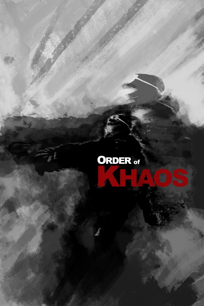
This was my second attempt at the Order of Khaos branding project. Playing with some positive and negative space, really wanting to push that street, revolutionary, feel.
The original idea was a simple one that quickly got out of hand as my (then) newly downloaded Photoshop watercolor brushes possessed me.
Added some shadow, duplicate image with an opacity change. I wanted it to feel like those ghost images you see of the people caught in nuclear explosions. Using a flaming outline to separate the midground image with the background one.
I think this is where I got my OK movie poster idea from. Looking at it now, this is way too centered (vertically), it feels like it the whole image wants to be dropped down until the text is resting on the lower third. I like that old propaganda poster feel the top portion of it is giving me. I might re-visit this sometime in the future.
“Never explain — your friends do not need it and your enemies will not believe you anyhow.” -Elbert Hubbard


